CSS Borders
By Flavio Copes
Learn how to work with borders in CSS using border-style, border-color and border-width, the border shorthand, and border-radius to create rounded corners.
The border is a thin layer between padding and margin. Editing the border you can make elements draw their perimeter on screen.
You can work on borders by using those properties:
border-styleborder-colorborder-width
The property border can be used as a shorthand for all those properties.
border-radius is used to create rounded corners.
You also have the ability to use images as borders, an ability given to you by border-image and its specific separate properties:
border-image-sourceborder-image-sliceborder-image-widthborder-image-outsetborder-image-repeat
Let’s start with border-style.
The border style
The border-style property lets you choose the style of the border. The options you can use are:
dotted
dashedsoliddoublegrooveridgeinsetoutsetnonehidden
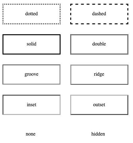
Check this Codepen for a live example
The default for the style is none, so to make the border appear at all you need to change it to something else. solid is a good choice most of the times.
You can set a different style for each edge using the properties
border-top-styleborder-right-styleborder-bottom-styleborder-left-style
or you can use border-style with multiple values to define them, using the usual Top-Right-Bottom-Left order:
p {
  border-style: solid dotted solid dotted;
}The border width
border-width is used to set the width of the border.
You can use one of the pre-defined values:
thinmedium(the default value)thick
or express a value in pixels, em or rem or any other valid length value.
Example:
p {
  border-width: 2px;
}
You can set the width of each edge (Top-Right-Bottom-Left) separately by using 4 values:
p {
  border-width: 2px 1px 2px 1px;
}
or you can use the specific edge properties border-top-width, border-right-width, border-bottom-width, border-left-width.
The border color
border-color is used to set the color of the border.
If you don’t set a color, the border by default is colored using the color of the text in the element.
You can pass any valid color value to border-color.
Example:
p {
  border-color: yellow;
}
You can set the color of each edge (Top-Right-Bottom-Left) separately by using 4 values:
p {
  border-color: black red yellow blue;
}
or you can use the specific edge properties border-top-color , border-right-color , border-bottom-color , border-left-color .
The border shorthand property
Those 3 properties mentioned, border-width, border-style and border-color can be set using the shorthand property border.
Example:
p {
  border: 2px black solid;
}
You can also use the edge-specific properties border-top, border-right, border-bottom, border-left.
Example:
p {
  border-left: 2px black solid;
  border-right: 3px red dashed;
}
The border radius
border-radius is used to set rounded corners to the border. You need to pass a value that will be used as the radius of the circle that will be used to round the border.
Usage:
p {
  border-radius: 3px;
}
You can also use the edge-specific properties border-top-left-radius, border-top-right-radius, border-bottom-left-radius, border-bottom-right-radius.
To experiment with radius values (and shadows too), try my free shadow and radius generator.
Using images as borders
One very cool thing with borders is the ability to use images to style them. This lets you go very creative with borders.
We have 5 properties:
border-image-sourceborder-image-sliceborder-image-widthborder-image-outsetborder-image-repeat
and the shorthand border-image. I won’t go in much details here as images as borders would need a more in-depth coverage as the one I can do in this little chapter. I recommend reading the CSS Tricks almanac entry on border-image for more information.
Want me to talk about your product? You can sponsor this site.