Introduction to CSS Transitions
CSS Transitions are the most simple way to create an animation in CSS. In a transition, you change the value of a property, and you tell CSS to slowly change it according to some parameters, towards a final state
- Introduction to CSS Transitions
- Example of a CSS Transition
- Transition timing function values
- CSS Transitions in Browser DevTools
- Which Properties you can Animate using CSS Transitions
Introduction to CSS Transitions
CSS Transitions are the most simple way to create an animation in CSS.
In a transition, you change the value of a property, and you tell CSS to slowly change it according to some parameters, towards a final state.
CSS Transitions are defined by these properties:
| Property | Description |
|---|---|
transition-property | the CSS property that should transition |
transition-duration | the duration of the transition |
transition-timing-function | the timing function used by the animation (common values: linear, ease). Default: ease |
transition-delay | optional number of seconds to wait before starting the animation |
The transition property is a handy shorthand:
.container {
  transition: property duration timing-function delay;
}
Example of a CSS Transition
This code implements a CSS Transition:
.one,
.three {
  background: rgba(142, 92, 205, 0.75);
  transition: background 1s ease-in;
}

.two,
.four {
  background: rgba(236, 252, 100, 0.75);
}

.circle:hover {
  background: rgba(142, 92, 205, 0.25); /* lighter */
}
See the example on Glitch https://glitch.com/edit/#!/flavio-css-transitions-example
When hovering the .one and .three elements, the purple circles, there is a transition animation that ease the change of background, while the yellow circles do not, because they do not have the transition property defined.
Transition timing function values
transition-timing-function allows to specify the acceleration curve of the transition.
There are some simple values you can use:
| Value |
|---|
| linear |
| ease |
| ease-in |
| ease-out |
| ease-in-out |
This Glitch shows how those work in practice.
You can create a completely custom timing function using cubic bezier curves. This is rather advanced, but basically any of those functions above is built using bezier curves. We have handy names as they are common ones.
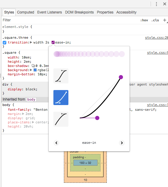
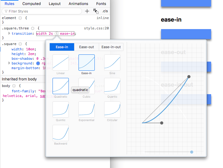
CSS Transitions in Browser DevTools
The Browser DevTools offer a great way to visualize transitions.
This is Chrome:

This is Firefox:

From those panels you can live edit the transition and experiment in the page directly without reloading your code.
Which Properties you can Animate using CSS Transitions
A lot! But not all CSS properties.
Here’s the full list:
| Property |
|---|
| background |
| background-color |
| background-position |
| background-size |
| border |
| border-color |
| border-width |
| border-bottom |
| border-bottom-color |
| border-bottom-left-radius |
| border-bottom-right-radius |
| border-bottom-width |
| border-left |
| border-left-color |
| border-left-width |
| border-radius |
| border-right |
| border-right-color |
| border-right-width |
| border-spacing |
| border-top |
| border-top-color |
| border-top-left-radius |
| border-top-right-radius |
| border-top-width |
| bottom |
| box-shadow |
| caret-color |
| clip |
| color |
| column-count |
| column-gap |
| column-rule |
| column-rule-color |
| column-rule-width |
| column-width |
| columns |
| content |
| filter |
| flex |
| flex-basis |
| flex-grow |
| flex-shrink |
| font |
| font-size |
| font-size-adjust |
| font-stretch |
| font-weight |
| grid-area |
| grid-auto-columns |
| grid-auto-flow |
| grid-auto-rows |
| grid-column-end |
| grid-column-gap |
| grid-column-start |
| grid-column |
| grid-gap |
| grid-row-end |
| grid-row-gap |
| grid-row-start |
| grid-row |
| grid-template-areas |
| grid-template-columns |
| grid-template-rows |
| grid-template |
| grid |
| height |
| left |
| letter-spacing |
| line-height |
| margin |
| margin-bottom |
| margin-left |
| margin-right |
| margin-top |
| max-height |
| max-width |
| min-height |
| min-width |
| opacity |
| order |
| outline |
| outline-color |
| outline-offset |
| outline-width |
| padding |
| padding-bottom |
| padding-left |
| padding-right |
| padding-top |
| perspective |
| perspective-origin |
| quotes |
| right |
| tab-size |
| text-decoration |
| text-decoration-color |
| text-indent |
| text-shadow |
| top |
| transform. |
| vertical-align |
| visibility |
| width |
| word-spacing |
| z-index |
→ I wrote 17 books to help you become a better developer:
- C Handbook
- Command Line Handbook
- CSS Handbook
- Express Handbook
- Git Cheat Sheet
- Go Handbook
- HTML Handbook
- JS Handbook
- Laravel Handbook
- Next.js Handbook
- Node.js Handbook
- PHP Handbook
- Python Handbook
- React Handbook
- SQL Handbook
- Svelte Handbook
- Swift Handbook
Also, JOIN MY CODING BOOTCAMP, an amazing cohort course that will be a huge step up in your coding career - covering React, Next.js - next edition February 2025