SwiftUI forms: Toggle
By Flavio Copes
Learn how to use the Toggle control in SwiftUI to get an on or off choice from the user, binding a Bool value to its isOn parameter like the Settings app.
Another common form control is Toggle. It gets an on/off choice from the user.
You can see it widely used in the Settings app.
A Toggle needs a Bool to work with. We store it in a @State property and pass it with the $ prefix:
struct ContentView: View {
    @State private var enabled = true

    var body: some View {
        Form {
            Toggle("Enable?", isOn: $enabled)
        }
    }
}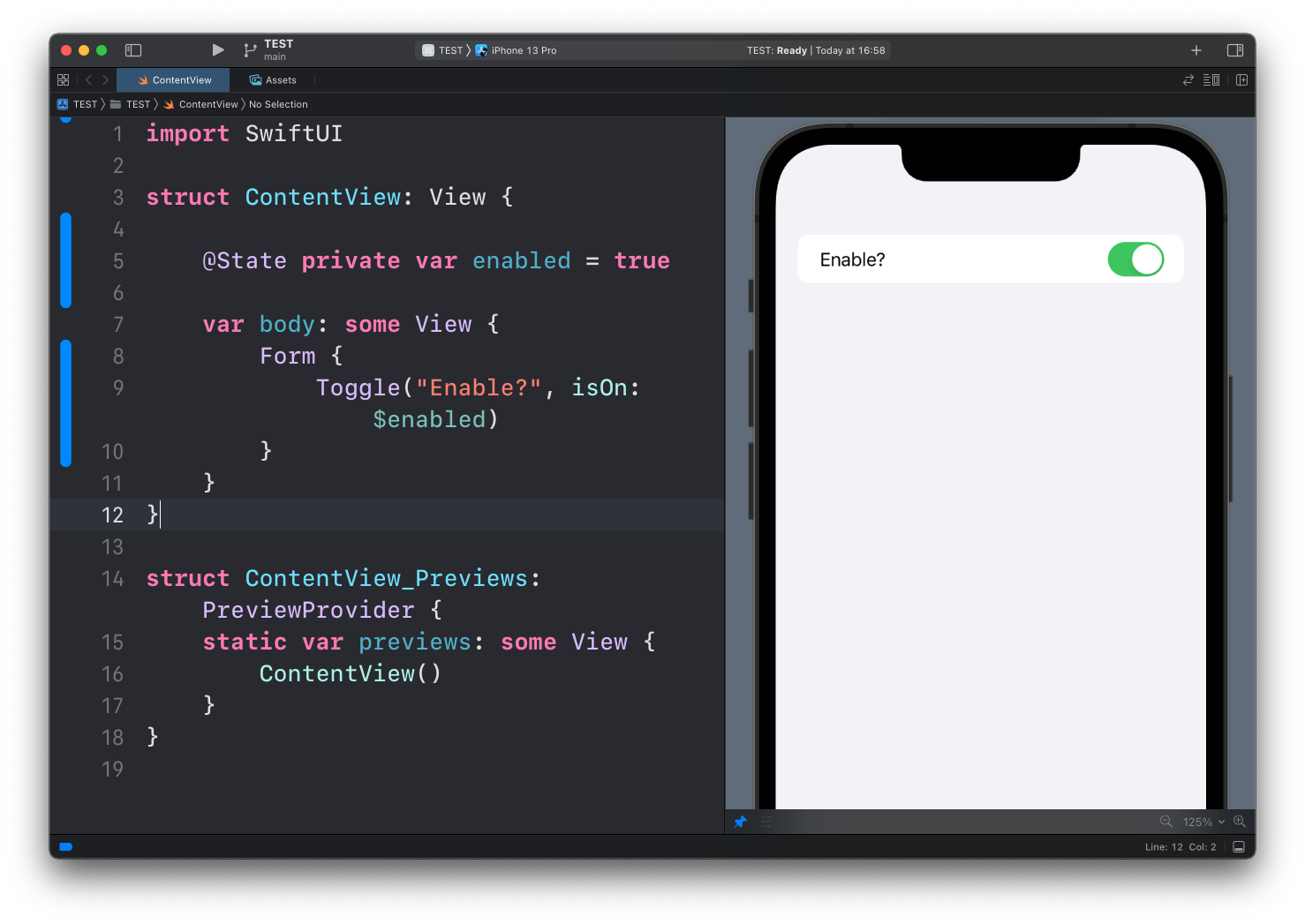
It works similarly to a TextField view, except instead of a String value passed with the text parameter, we pass a Bool value to isOn.
If you set the initial value to true the toggle starts enabled, if you set it to false it starts disabled:
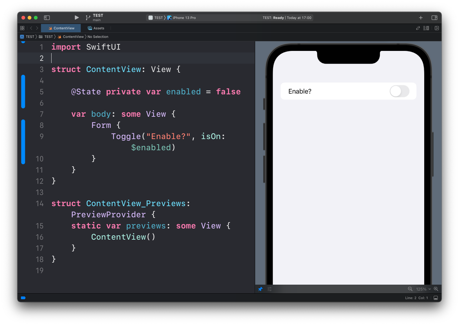
When the user flips the switch, the bound property updates automatically. When your code changes the property, the switch flips. The binding works in both directions.
Using the value elsewhere
The whole point of binding state is that the rest of the view can react to it. Here’s a realistic notifications setting:
struct SettingsView: View {
    @State private var notificationsEnabled = false
    @State private var playSounds = true

    var body: some View {
        Form {
            Toggle("Allow notifications", isOn: $notificationsEnabled)

            if notificationsEnabled {
                Toggle("Play sounds", isOn: $playSounds)
            }
        }
    }
}
The “Play sounds” row only exists while notifications are on. Flip the first toggle and watch the second row slide in and out. Inside a Form or a List, SwiftUI animates this insertion for you. Outside those containers, you can request the animation explicitly with .animation(.default, value: notificationsEnabled) on the enclosing stack.
Labels with an icon
The label doesn’t have to be plain text. Pass a Label to get an icon next to it, like the rows in the Settings app:
Toggle(isOn: $notificationsEnabled) {
    Label("Notifications", systemImage: "bell.badge")
}
Toggle styles
On iOS the default appearance is the switch. You can change it with the toggleStyle() modifier.
.button turns the toggle into a button that shows a highlighted state when on:
Toggle("Bold", isOn: $isBold)
    .toggleStyle(.button)
This is great for toolbars and formatting controls, where a switch would look out of place.
On macOS the default inside a form is a checkbox. If you want the iOS-style switch there too, ask for it with .toggleStyle(.switch).
Want me to talk about your product? You can sponsor this site.
Related posts about swift: