A deep dive into StyleX
By Flavio Copes
Learn how StyleX turns JavaScript style objects into regular CSS classes at build time, with React and Astro setup, variants, themes, and responsive styles.
StyleX is a JavaScript syntax and compiler for styling web applications.
You write styles as JavaScript objects. During the build, StyleX turns them into a regular CSS file.
This makes StyleX look like CSS-in-JS while we write it. But the browser receives normal CSS classes.
There is no style injection during production rendering.
That distinction is the key to understanding StyleX.
StyleX changes how we write CSS. It does not replace the need to understand it. If you’re still learning CSS, start with my free CSS course.
In this tutorial we’ll set up StyleX with React and Vite. Then we’ll use its main features and look at the tradeoffs.
The problem StyleX tries to solve
CSS is easy to start with.
Create a class, add a few properties, and use the class in your markup.
The problems appear when an application grows.
You start asking questions like these:
- Is this class name already used?
- Can I delete this rule?
- Why does another selector override it?
- Which file owns this style?
- How do I customize a shared component safely?
- How much unused CSS are we shipping?
Teams solve these problems in different ways. We have naming systems, CSS Modules, utility classes, CSS-in-JS libraries, and design systems.
StyleX makes a specific set of choices:
- styles live beside the component
- every CSS declaration becomes a small reusable class
- class names cannot collide
- styles compose through JavaScript
- conflicts resolve predictably
- types and lint rules catch mistakes
- the compiler creates the CSS file during the build
StyleX was created at Meta for very large interfaces. Meta says it now powers Facebook, Instagram, WhatsApp, Messenger, and Threads.
Linear migrated to it in 2026. They moved their React apps off styled-components in more than 1,000 PRs.
This does not mean you need a Meta-sized application. It tells us which problems shaped the tool.
The StyleX mental model
The StyleX flow looks like this:
JavaScript style objects
        ↓
StyleX compiler
        ↓
small reusable class names + regular CSS
        ↓
the browser applies normal CSS
Suppose we write this:
const styles = stylex.create({
  title: {
    color: 'rebeccapurple',
    fontSize: 32,
  },
})
StyleX creates one class for color and another for fontSize.
The exact generated names are hashes. A simplified result looks like this:
.x-color {
  color: rebeccapurple;
}

.x-size {
  font-size: 32px;
}
The component receives both class names:
<h1 class="x-color x-size">Learn StyleX</h1>If another component uses the same declaration, StyleX can reuse the atomic class. Common declarations are deduplicated, so the CSS output grows slowly as the application grows.
Set up StyleX with React and Vite
Let’s start with a new React project.
Create it with Vite:
npm create vite@latest stylex-demo -- --template react-ts
cd stylex-demo
npm installcreate-vite, the package behind npm create vite, has its own version number. Version 9 is the current one, and it scaffolds a Vite 8 project.
Install the StyleX runtime and the Vite compiler plugin:
npm install @stylexjs/stylex@0
npm install --save-dev @stylexjs/unplugin@0
I use the @0 selector here to install the latest 0.x release without fixing the tutorial to one patch version.
Open vite.config.ts and add the StyleX plugin:
import { defineConfig } from 'vite'
import react from '@vitejs/plugin-react'
import stylex from '@stylexjs/unplugin'

export default defineConfig(({ mode }) => ({
  plugins: [
    stylex.vite({
      dev: mode === 'development',
      useCSSLayers: true,
    }),
    react(),
  ],
}))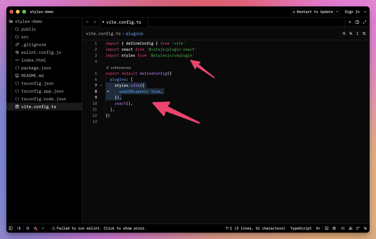
Keep stylex.vite() before react(). This lets StyleX transform the files without breaking React Fast Refresh.
Vite also needs a CSS entry file. The default project already imports src/index.css, so we can keep it.
The plugin appends the generated StyleX rules to the CSS asset Vite creates.
Start the development server:
npm run devStyleX is now ready.
You can also scaffold a configured project with the official command:
npm create @stylexjs@0 my-appI used the manual Vite setup because it shows the only important build step.
Create your first StyleX component
Create src/CourseCard.tsx.
First, import StyleX and define a few styles:
import * as stylex from '@stylexjs/stylex'

const styles = stylex.create({
  card: {
    backgroundColor: 'white',
    borderColor: '#d8d8d8',
    borderRadius: 16,
    borderStyle: 'solid',
    borderWidth: 1,
    display: 'grid',
    gap: 16,
    maxWidth: 520,
    padding: 24,
  },
  title: {
    color: '#222',
    fontSize: 24,
    lineHeight: 1.2,
    marginBlock: 0,
  },
  description: {
    color: '#666',
    lineHeight: 1.6,
    marginBlock: 0,
  },
})
stylex.create() receives named groups of styles.
I called them card, title, and description. These names only need to make sense inside this file.
Now apply the styles with stylex.props():
export function CourseCard() {
  return (
    <article {...stylex.props(styles.card)}>
      <h2 {...stylex.props(styles.title)}>CSS Foundations</h2>
      <p {...stylex.props(styles.description)}>
        Learn the cascade, layout, and responsive design.
      </p>
    </article>
  )
}
stylex.props() returns an object containing className and, when needed, style.
Spreading that object applies both correctly.
Use the component from src/App.tsx:
import { CourseCard } from './CourseCard'

export default function App() {
  return <CourseCard />
}
This is the core StyleX workflow:
- define styles with
stylex.create() - apply styles with
stylex.props()
Most of the library builds on those two functions.
Debug styles with StyleX DevTools
Our Vite configuration enables StyleX development mode when we run npm run dev.
In this mode, StyleX adds data-style-src attributes and readable marker class names to the page. These point back to the style objects in our source files.
Install the StyleX DevTools Chrome extension. Then open the browser developer tools, select an element in the Elements panel, and open the StyleX tab in the sidebar.
The extension shows which style objects are applied, their order, and where they come from. You can also jump to the relevant JavaScript or TypeScript file.
Use StyleX with Astro
StyleX also works in an Astro project.
Astro uses Vite, so we can use the same StyleX Vite plugin. We do not need a separate Astro integration.
StyleX works best here inside React components. Astro can render those components to static HTML, or hydrate them when they need client-side JavaScript.
Add React to an existing Astro project:
npx astro add reactThen install StyleX and its compiler plugin:
npm install @stylexjs/stylex@0
npm install --save-dev @stylexjs/unplugin@0
Open astro.config.mjs and add the StyleX Vite plugin:
import react from '@astrojs/react'
import { defineConfig } from 'astro/config'
import stylex from '@stylexjs/unplugin'

export default defineConfig({
  integrations: [react()],
  vite: {
    plugins: [
      stylex.vite({
        useCSSLayers: true,
      }),
    ],
  },
})
We also need a CSS entry file. The StyleX plugin adds its generated rules to the CSS produced by Vite.
Create src/styles/global.css if the project does not have one:
body {
  margin: 0;
}
Import it from the shared Astro layout.
StyleX exposes its development stylesheet at /virtual:stylex.css. Its small development runtime refreshes that stylesheet when we change a component.
Add both to the layout <head> in development:
---
import '../styles/global.css'
---

<html lang="en">
  <head>
    <meta charset="utf-8" />

    {
      import.meta.env.DEV && (
        <>
          <link rel="stylesheet" href="/virtual:stylex.css" />
          <script
            type="module"
            src="/@id/virtual:stylex:runtime"
          ></script>
        </>
      )
    }
  </head>
  <body>
    <slot />
  </body>
</html>
Those two tags only appear during development. The production build extracts the rules and includes them in Astro’s normal CSS output.
We can now use the CourseCard component we created earlier from an Astro page:
---
import { CourseCard } from '../components/CourseCard'
import Layout from '../layouts/Layout.astro'
---

<Layout>
  <CourseCard />
</Layout>
There is no client: directive here. Astro renders the React component to static HTML and sends no component JavaScript to the browser.
If the component needs state or browser events, hydrate it as you would hydrate any other React component:
<CourseCard client:load />Keep stylex.create() inside .js, .jsx, .ts, or .tsx files. The current StyleX plugin does not transform .astro component syntax directly.
I would divide the work like this:
- global CSS handles resets, fonts, and document defaults
- Astro styles handle small native Astro components
- StyleX handles reusable React components and islands
Run the normal Astro build when the project is ready:
npm run buildThe final page contains static class names and extracted CSS. React hydration is optional and separate from StyleX.
Why StyleX creates atomic CSS
An atomic CSS class contains one declaration.
This sounds wasteful at first. One element might receive several generated classes.
But the same class can be reused everywhere.
Consider these styles:
const styles = stylex.create({
  card: {
    padding: 16,
  },
  dialog: {
    padding: 16,
  },
})
StyleX does not need two identical padding: 16px rules. It can generate one atomic rule and use it twice.
This changes how the stylesheet grows.
With traditional component classes, every component can add another block of declarations. With atomic CSS, common property and value pairs become shared building blocks.
The HTML has more class names. The stylesheet has less repetition.
The compiler also removes local stylex.create() calls. It can compile local stylex.props() calls too.
When styles cross module boundaries, StyleX keeps a tiny runtime representation so it can merge them. The CSS still comes from the file created during the build.
Compose styles without specificity fights
Style composition is one of the best parts of StyleX.
Add a featured version of the card:
const styles = stylex.create({
  card: {
    borderColor: '#d8d8d8',
    borderStyle: 'solid',
    borderWidth: 1,
    padding: 24,
  },
  featured: {
    borderColor: '#e4511e',
    padding: 32,
  },
})
Apply both styles:
<article {...stylex.props(styles.card, styles.featured)} />For the same property, the later style wins.
The resulting card uses the orange border and 32 pixels of padding.
The source order of the generated CSS does not decide this. stylex.props() resolves the conflict before the browser sees the class list.
There is one detail to remember. StyleX supports different style-resolution modes.
With the current default, a longhand such as marginTop has priority over a shorthand such as margin. Direct conflicts between the same property still follow application order.
My advice is to prefer logical longhands such as marginBlockStart and paddingInline. They make the intent clear and work in both left-to-right and right-to-left layouts.
Apply conditional styles
StyleX does not need a special conditional API.
Use normal JavaScript:
type CourseCardProps = {
  featured?: boolean
}

export function CourseCard({ featured = false }: CourseCardProps) {
  return (
    <article
      {...stylex.props(
        styles.card,
        featured && styles.featured,
      )}
    >
      {/* ... */}
    </article>
  )
}
stylex.props() ignores false, null, and undefined values.
This also works with a ternary expression:
<span
  {...stylex.props(
    styles.status,
    complete ? styles.complete : styles.inProgress,
  )}
/>
The important part is that every possible style remains visible to the compiler.
Create variants with object lookups
Components often have named variants.
A button might be primary, secondary, or danger.
StyleX uses another normal JavaScript pattern for this:
const colorStyles = stylex.create({
  primary: {
    backgroundColor: '#222',
    color: 'white',
  },
  secondary: {
    backgroundColor: '#eee',
    color: '#222',
  },
  danger: {
    backgroundColor: '#b42318',
    color: 'white',
  },
})
Use the variant name as an object key:
type ButtonProps = {
  color?: keyof typeof colorStyles
  children: React.ReactNode
}

export function Button({
  color = 'primary',
  children,
}: ButtonProps) {
  return (
    <button {...stylex.props(styles.button, colorStyles[color])}>
      {children}
    </button>
  )
}
TypeScript now limits color to the keys StyleX created.
There is no variant configuration to keep synchronized with the styles.
Add hover, focus, and active states
Pseudo-classes live inside the property they change.
Here is an interactive button:
const styles = stylex.create({
  button: {
    backgroundColor: {
      default: '#222',
      ':hover': '#444',
      ':active': '#000',
      ':disabled': '#aaa',
    },
    color: 'white',
    cursor: {
      default: 'pointer',
      ':disabled': 'not-allowed',
    },
    outline: {
      default: 'none',
      ':focus-visible': '3px solid #ff8a50',
    },
  },
})
Notice that backgroundColor owns all its states.
This structure makes conflicts easier to see. We do not have a separate selector block hidden elsewhere.
Pseudo-elements use a different shape. Put them at the top level of the style:
const styles = stylex.create({
  input: {
    color: '#222',
    '::placeholder': {
      color: '#888',
    },
  },
})
StyleX recommends using real elements instead of decorative ::before and ::after elements when possible.
Write responsive styles
Media queries use the same property-first structure.
Let’s make the course card responsive:
const styles = stylex.create({
  card: {
    gap: {
      default: 12,
      '@media (min-width: 48rem)': 16,
    },
    padding: {
      default: 16,
      '@media (min-width: 48rem)': 24,
    },
  },
})
Each property contains its default and responsive values.
The same pattern works with @supports and container queries.
You can also combine a pseudo-class with a media query:
const styles = stylex.create({
  button: {
    transform: {
      default: 'translateY(0)',
      ':hover': {
        default: 'translateY(-2px)',
        '@media (prefers-reduced-motion: reduce)': null,
      },
    },
  },
})
Returning null means StyleX does not apply a value for that condition.
If media queries are new to you, my free CSS course covers responsive design before adding a styling tool on top.
Use dynamic values sparingly
Most UI states should use conditional styles.
Sometimes the value only exists at runtime. A progress bar is a good example.
Define a style function:
const styles = stylex.create({
  progress: (value: number) => ({
    width: `${value}%`,
  }),
})
Call it with the runtime value:
const value = Math.min(100, Math.max(0, progress))

return (
  <div
    aria-valuemax={100}
    aria-valuemin={0}
    aria-valuenow={value}
    role="progressbar"
  >
    <div {...stylex.props(styles.progress(value))} />
  </div>
)
StyleX creates a static class that reads a CSS variable. It then puts the runtime value in the element’s style attribute.
The style function has strict rules. Its arguments must be simple identifiers, and its body must return an object literal.
This is valid:
height: (value: number) => ({ height: value })This is not:
height: ({ value }: { value: number }) => {
  return { height: value }
}
The restriction lets the compiler understand the style.
Use dynamic styles when the value is truly dynamic. For known states such as small and large, use variants instead.
Create design tokens
Hardcoded values are fine for learning. A real application should share colors, spacing, and typography.
StyleX creates typed CSS variables with stylex.defineVars().
Create src/tokens.stylex.ts:
import * as stylex from '@stylexjs/stylex'

export const colors = stylex.defineVars({
  accent: '#e4511e',
  canvas: '#f3f0e8',
  muted: '#666',
  surface: '#fff',
  text: '#222',
})

export const spacing = stylex.defineVars({
  small: '8px',
  medium: '16px',
  large: '24px',
})
The file name matters. Shared variables must live in a .stylex.js, .stylex.ts, or equivalent StyleX file.
They must also be named exports.
Import the tokens into a component:
import { colors, spacing } from './tokens.stylex'

const styles = stylex.create({
  card: {
    backgroundColor: colors.surface,
    color: colors.text,
    padding: spacing.large,
  },
  link: {
    color: colors.accent,
  },
})
The component does not know the generated CSS variable names. It uses typed JavaScript references.
To use StyleX themes, enable module resolution in vite.config.ts:
stylex.vite({
  useCSSLayers: true,
  unstable_moduleResolution: {
    type: 'commonJS',
    rootDir: process.cwd(),
  },
})
The theming APIs are stable. The configuration key still includes unstable because its shape may change.
Create a theme
A StyleX theme overrides one variable group for part of the page.
Create src/themes.ts:
import * as stylex from '@stylexjs/stylex'
import { colors } from './tokens.stylex'

export const darkTheme = stylex.createTheme(colors, {
  accent: '#ff9566',
  canvas: '#171717',
  muted: '#aaa',
  surface: '#242424',
  text: '#f5f5f5',
})
Apply it like any other StyleX style:
<main {...stylex.props(darkTheme, styles.page)}>
  <CourseCard />
</main>
The theme changes the variables on main. Descendant components keep using the same imported token references.
Components consume semantic tokens, while themes decide their values.
Accept styles from a parent component
Reusable components often need a small escape hatch.
StyleX lets us pass style objects across component boundaries:
import type { ReactNode } from 'react'
import type { StyleXStyles } from '@stylexjs/stylex'

type CourseCardProps = {
  children: ReactNode
  style?: StyleXStyles
}

export function CourseCard({ children, style }: CourseCardProps) {
  return (
    <article {...stylex.props(styles.card, style)}>
      {children}
    </article>
  )
}
The parent style comes last, so it can customize the card.
You can limit which properties the component accepts:
type CourseCardProps = {
  children: ReactNode
  style?: StyleXStyles<{
    marginBlock?: string | number
    maxWidth?: string | number
  }>
}
Now a caller can change the outer spacing and width. It cannot replace the card’s colors or internal padding.
This is more useful than accepting an unrestricted className string. The component’s customization contract is visible in its type.
Create keyframe animations
StyleX can generate keyframes too.
Define the animation first:
const fadeIn = stylex.keyframes({
  from: { opacity: 0 },
  to: { opacity: 1 },
})
Use the returned value inside a style:
const styles = stylex.create({
  card: {
    animationDuration: '300ms',
    animationName: fadeIn,
    animationTimingFunction: 'ease-out',
  },
})
StyleX creates and references the final keyframe name for us.
We do not pass a global animation name around as a string.
Use inline atoms for small exceptions
StyleX normally keeps style definitions away from the JSX.
The optional @stylexjs/atoms package offers utility-like atomic styles for small one-off cases.
Install it separately:
npm install @stylexjs/atoms@0Then use its atomic values with stylex.props():
import * as stylex from '@stylexjs/stylex'
import x from '@stylexjs/atoms'

<div
  {...stylex.props(
    x.display.flex,
    x.alignItems.center,
    x.gap._8px,
  )}
/>
This feels closer to a utility-class workflow.
I would use atoms for tiny local exceptions. For a reusable component, I prefer named styles such as styles.toolbar and styles.active.
The name explains why a style is present. The list of utilities only explains what it does.
Understand the static constraints
StyleX needs to understand styles during the build.
This means a style object cannot run arbitrary JavaScript.
This works:
const space = 16

const styles = stylex.create({
  card: {
    padding: space * 2,
  },
})
The compiler can resolve the value.
An imported ordinary value does not work:
import { cardPadding } from './settings'

const styles = stylex.create({
  card: {
    padding: cardPadding,
  },
})
Use stylex.defineVars() or stylex.defineConsts() for values shared between files.
Object spreads are also not allowed inside raw style objects:
const styles = stylex.create({
  card: {
    ...sharedStyles,
    padding: 24,
  },
})
Compose compiled styles with stylex.props() instead.
These rules can feel strict. They are what make static extraction possible.
Keep global CSS for global jobs
StyleX styles elements through classes applied directly to those elements.
It discourages global selectors and complex descendant selectors. This prevents a rule in one component from changing an unrelated child.
Keep a small global stylesheet for jobs such as these:
- a CSS reset
- default body styles
- font-face declarations
- styles for raw HTML coming from a CMS
When CSS layers are enabled, put the reset in its own layer:
@layer reset {
  *,
  *::before,
  *::after {
    box-sizing: border-box;
  }

  body {
    margin: 0;
  }
}
Then place the reset before the StyleX layers:
stylex.vite({
  useCSSLayers: {
    before: ['reset'],
    prefix: 'stylex',
  },
})
Be careful with unlayered global rules. Unlayered CSS has priority over layered CSS, so a broad global selector can override a StyleX component.
If you need to observe the state of an ancestor, descendant, or sibling, StyleX also provides the stylex.when APIs and marker classes. I would reach for those only when a component truly needs that relationship.
Add linting
The compiler focuses on producing CSS. The StyleX ESLint plugin catches authoring mistakes and can enforce project rules.
Install it:
npm install --save-dev @stylexjs/eslint-plugin@0Useful rules include validation, unused-style detection, shorthand checks, and key sorting.
You can also restrict values for individual properties. For example, this rule allows only a small spacing scale:
'@stylexjs/valid-styles': [
  'error',
  {
    propLimits: {
      padding: {
        limit: [0, 4, 8, 16, 24, 32],
        reason: 'Use the project spacing scale',
      },
    },
  },
]
This is where StyleX becomes more than a syntax choice. Types and lint rules can turn design decisions into checks.
Why StyleX is interesting for coding agents
I think StyleX becomes more interesting when coding agents write most of the UI code.
Tailwind is a great language for humans. Its short classes are fast to type, easy to scan once learned, and excellent for experimenting in markup.
StyleX is more verbose. That matters less when an agent does the typing.
When an agent does most of the typing, speed matters less to me. I care more about which system makes inconsistent code harder to create.
StyleX gives an agent a smaller space of acceptable choices:
- use known CSS property names
- define styles inside
stylex.create() - compose them through
stylex.props() - import shared values through StyleX tokens
- avoid selectors that style distant elements
- follow the component’s typed style contract
- pass the project’s lint rules
An agent can write valid plain CSS in many ways. That flexibility is not always helpful.
The same spacing can become 16px, 1rem, a custom property, a utility class, or a value copied from a nearby component. All can render the same result while making the codebase less consistent.
StyleX removes some of those choices. During review, I can focus on whether the interface is correct instead of normalizing class order, naming choices, or arbitrary values.
This does not make StyleX automatically agent-friendly. A project still needs good tokens, clear component boundaries, lint rules, and examples.
Tailwind can also be constrained. You can ban arbitrary values, share a theme, and enforce conventions.
StyleX starts from the stricter side. That default is what I find interesting.
The cost of those constraints
StyleX is not a free improvement.
The setup is more involved than importing a CSS file. The compiler must work with your bundler, framework, tests, and packages.
The syntax is also longer than utility classes:
paddingInline: 16compared with:
class="px-4"Humans feel that difference more than agents do.
The component ecosystem is another cost. Many copy-and-paste component collections use Tailwind. Choosing StyleX means converting those styles or finding StyleX-native alternatives.
Copy-and-paste components are easier to convert than opaque package components because the source is already yours, but you still need to do the conversion.
StyleX also asks us to give up some CSS patterns. If a page depends on large global stylesheets, deep selectors, or content that does not live in JavaScript components, StyleX may fight the architecture.
StyleX compared with other approaches
Here is how the approaches compare:
| Approach | What you write | What ships | Main strength | Main cost |
|---|---|---|---|---|
| Plain CSS | CSS rules and selectors | Static CSS | Native, flexible, no library | You manage scope and composition |
| Tailwind | Utility classes in markup | Generated CSS | Fast authoring and a huge ecosystem | Markup grows and arbitrary choices can return |
| Runtime CSS-in-JS | JavaScript or template strings | JavaScript plus runtime-generated styles | Dynamic component styling | Runtime work and more JavaScript |
| StyleX | Typed JavaScript objects | Generated CSS plus a tiny merge runtime | Predictable composition at scale | Compiler setup and stricter rules |
StyleX is not a replacement for knowing CSS.
You still need to understand layout, inheritance, responsive design, accessibility, and the browser. StyleX changes how styles are authored and composed. It does not change what CSS properties do.
When I would use StyleX
I would use StyleX for a new React application with a growing component library.
I would be especially interested if coding agents were creating and changing many components. In that situation, predictable composition and typed boundaries are more valuable than terse syntax.
I would start with these rules:
- all reusable values come from StyleX tokens
- arbitrary values stay local and rare
- components accept narrow
StyleXStylescontracts - global CSS is limited to resets and document defaults
- linting runs in development and CI
- dynamic styles are used only for real runtime values
I would not migrate a working small project just to use it.
I also would not move this site to StyleX. flaviocopes.com is a static Astro site with a lot of Markdown content and an existing styling system. Most of its interface does not live in React components.
StyleX and Astro are not incompatible. The setup we saw works well when React components make up a meaningful part of the interface. It would add a compiler and a JavaScript-oriented component model here without solving an urgent problem.
For a new interface-heavy product, the calculation is different.
My first experiment would be one real feature, not a design-system rewrite. I would build the feature, inspect the generated CSS, test the development workflow, and let an agent make a few changes.
Then I would review whether the styles stayed local and the variants composed cleanly. I would also check if the tokens prevented random values and whether the diffs were easy to review.
That tells me more than my first impression of the syntax.
Build for production
Run the normal Vite build:
npm run buildOpen the generated CSS in dist/assets/.
You should see atomic rules with hashed class names. You should not see the original stylex.create() objects in the application code.
The generated files should follow this path:
typed style objects
        ↓
compile-time extraction
        ↓
deduplicated atomic rules
        ↓
normal CSS in the browser
I would evaluate StyleX as a compiler and a set of constraints, not as another way to spell CSS.
If you want to build the examples but React is still new to you, start with my free React course. The CSS course explains the browser concepts StyleX builds on.
Want me to talk about your product? You can sponsor this site.