React, how to make responsive JSX
By Flavio Copes
Learn how to make responsive JSX in React using the react-responsive package and its useMediaQuery hook to detect screen size and render different layouts.
To make JSX responsive, you use the react-responsive package and its useMediaQuery hook. The hook tells you if a media query matches, and you use that boolean to decide what to render.
CSS media queries are great for changing how something looks. But sometimes you want to render different components depending on the screen size, and that decision has to happen in JavaScript.
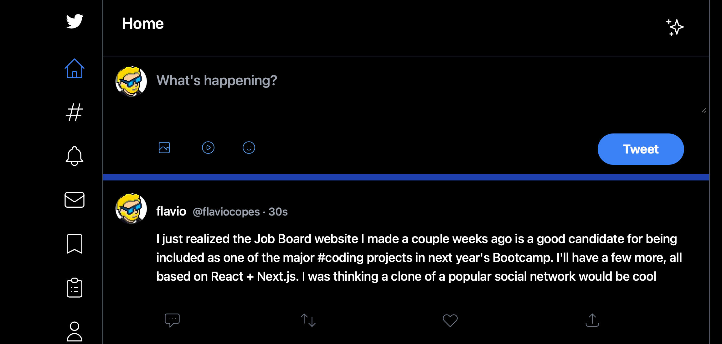
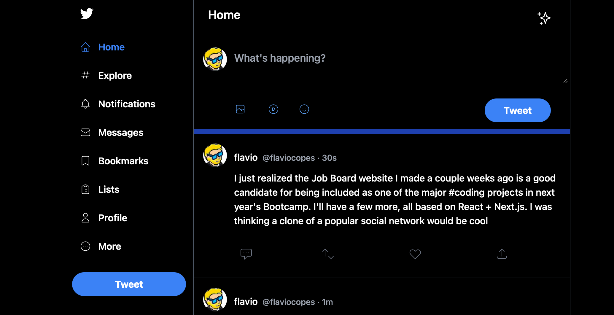
That was my case. I had the need to make a sidebar look in one particular way when in a big screen in React, and in another way when in a smaller screen, so I wanted to have some way to detect responsive layouts changes in JSX.
Like this:
Using the useMediaQuery hook
First install the package:
npm install react-responsivethen you can import the useMediaQuery hook:
import { useMediaQuery } from 'react-responsive'And in your components you can use it like this:
const isBigScreen = useMediaQuery({ query: '(min-device-width: 1224px)' })
const isSmallScreen = useMediaQuery({ query: '(max-width: 1224px)' })
The hook returns true or false. When the user resizes the window and the query result changes, the component re-renders automatically with the new value. You don’t have to listen for resize events yourself.
This is a simple example of breakpoints I found on the component’s home page, and they worked fine for my needs.
I used it in a layout component in this way:
import { useMediaQuery } from 'react-responsive'

export default function Layout({ children }) {
  const isBigScreen = useMediaQuery({ query: '(min-device-width: 1224px)' })
  const isSmallScreen = useMediaQuery({ query: '(max-width: 1224px)' })

  return (
    <div>
      {isSmallScreen ? (
        <LeftSidebar small={true} />
      ) : (
        <LeftSidebar />
      )}
    </div>
  )
}
I used it to pass a small prop to a LeftSidebar component, so it knew how to render itself.
Wrapping JSX in components
You can also do things differently and create components to wrap JSX, which I find nicer to see:
import { useMediaQuery } from 'react-responsive'

const BigScreen = ({ children }) => {
  return useMediaQuery({ minWidth: 992 }) ? children : null
}

const SmallScreen = ({ children }) => {
  return useMediaQuery({ maxWidth: 991 }) ? children : null
}

export default function Layout({ children }) {
  return (
    <div>
      <SmallScreen>
        <LeftSidebar small={true} />
      </SmallScreen>
      <BigScreen>
        <LeftSidebar />
      </BigScreen>
    </div>
  )
}
Notice this version passes the values directly as props, like minWidth, instead of writing the full query string. Both styles work.
Watch out with server-side rendering
One thing to be careful with: on the server there is no window, so the hook has no screen to measure. If your app is server-rendered, the first render may pick the wrong branch, and the layout can flash when the client takes over.
react-responsive lets you pass a second argument with the values to assume when no window exists:
const isBigScreen = useMediaQuery({ minWidth: 992 }, { width: 1200 })On a purely client-rendered app, like mine was, you don’t need to worry about this at all.
Want me to talk about your product? You can sponsor this site.