The CSS float property and clearing
How to work with the `float` property in CSS and with clearing
Floating has been a very important topic in the past.
It was used in lots of hacks and creative usages because it was one of the few ways, along with tables, we could really implement some layouts. In the past we used to float the sidebar to the left, for example, to show it on the left side of the screen and added some margin to the main content.
Luckily times have changed and today we have Flexbox and Grid to help us with layout, and float has gone back to its original scope: placing content on one side of the container element, and make its siblings show up around it.
The float property supports 3 values:
leftrightnone(the default)
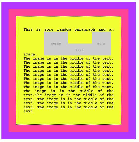
Say we have a box which contains a paragraph with some text, and the paragraph also contains an image.
Here’s some code:
<div class="parent">
  <div class="child">
    <div class="box">
      <p>This is some random paragraph and an image. <img src="https://via.placeholder.com/100x100" /> The image is in the middle of the text. The image is in the middle of the text. The image is in the middle of the text. The image is in the middle of the text. The image is in the middle of the text. The image is in the middle of the text. The image is in the middle of the text. The image is in the middle of the text. The image is in the middle of the text.
      </p>
    </div>
  </div>
</div>
.parent {
background-color: #af47ff;
padding: 30px;
width: 500px;
}
.child {
background-color: #ff4797;
padding: 30px;
}
.box {
background-color: #f3ff47;
padding: 30px;
border: 2px solid #333;
border-style: dotted;
font-family: courier;
text-align: justify;
font-size: 1rem;
}and the visual appearance:
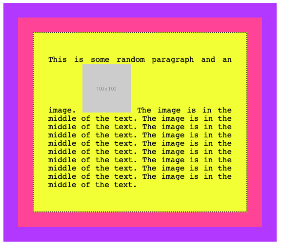
As you can see, the normal flow by default considers the image inline, and makes space for it in the line itself.
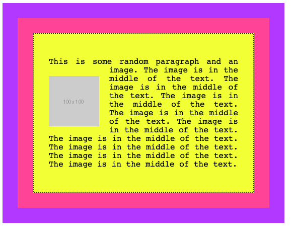
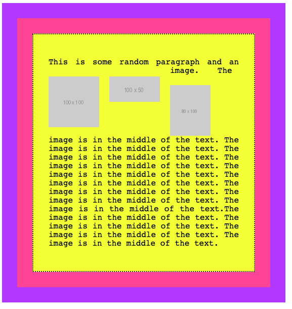
If we add float: left to the image, and some padding:
img {
  float: left;
  padding: 20px 20px 0px 0px;
}
this is the result:
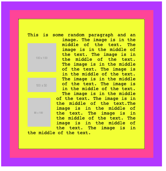
and this is what we get by applying a float: right, adjusting the padding accordingly:
img {
  float: right;
  padding: 20px 0px 20px 20px;
}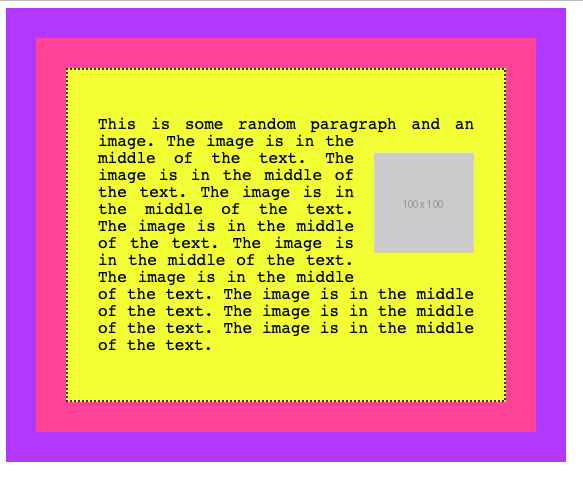
A floated element is removed from the normal flow of the page, and the other content flows around it.
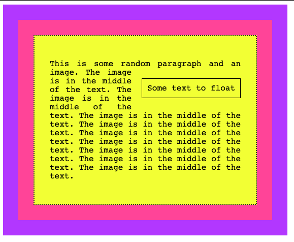
You are not limited to floating images, too. Here we switch the image with a span element:
<div class="parent">
  <div class="child">
    <div class="box">
      <p>This is some random paragraph and an image. <span>Some text to float</span> The image is in the middle of the text. The image is in the middle of the text. The image is in the middle of the text. The image is in the middle of the text. The image is in the middle of the text. The image is in the middle of the text. The image is in the middle of the text. The image is in the middle of the text. The image is in the middle of the text.
      </p>
    </div>
  </div>
</div>
span {
float: right;
margin: 20px 0px 20px 20px;
padding: 10px;
border: 1px solid black
}and this is the result:
Clearing
What happens when you float more than one element?
If when floated they find another floated image, by default they are stacked up one next to the other, horizontally. Until there is no room, and they will start being stacked on a new line.
Say we had 3 inline images inside a p tag:
If we add float: left to those images:
img {
  float: left;
  padding: 20px 20px 0px 0px;
}
this is what we’ll have:
if you add clear: left to images, those are going to be stacked vertically rather than horizontally:
I used the left value for clear. It allows
leftto clear left floatsrightto clear right floatsbothto clear both left and right floatsnone(default) disables clearing
download all my books for free
- javascript handbook
- typescript handbook
- css handbook
- node.js handbook
- astro handbook
- html handbook
- next.js pages router handbook
- alpine.js handbook
- htmx handbook
- react handbook
- sql handbook
- git cheat sheet
- laravel handbook
- express handbook
- swift handbook
- go handbook
- php handbook
- python handbook
- cli handbook
- c handbook
subscribe to my newsletter to get them
Terms: by subscribing to the newsletter you agree the following terms and conditions and privacy policy. The aim of the newsletter is to keep you up to date about new tutorials, new book releases or courses organized by Flavio. If you wish to unsubscribe from the newsletter, you can click the unsubscribe link that's present at the bottom of each email, anytime. I will not communicate/spread/publish or otherwise give away your address. Your email address is the only personal information collected, and it's only collected for the primary purpose of keeping you informed through the newsletter. It's stored in a secure server based in the EU. You can contact Flavio by emailing [email protected]. These terms and conditions are governed by the laws in force in Italy and you unconditionally submit to the jurisdiction of the courts of Italy.