Making a table responsive using CSS
A practical way to make tables display nice on mobile
A few days ago I got a warning from the Google Search Console. It detected a Mobile Usability issue on a page where I have a big table.
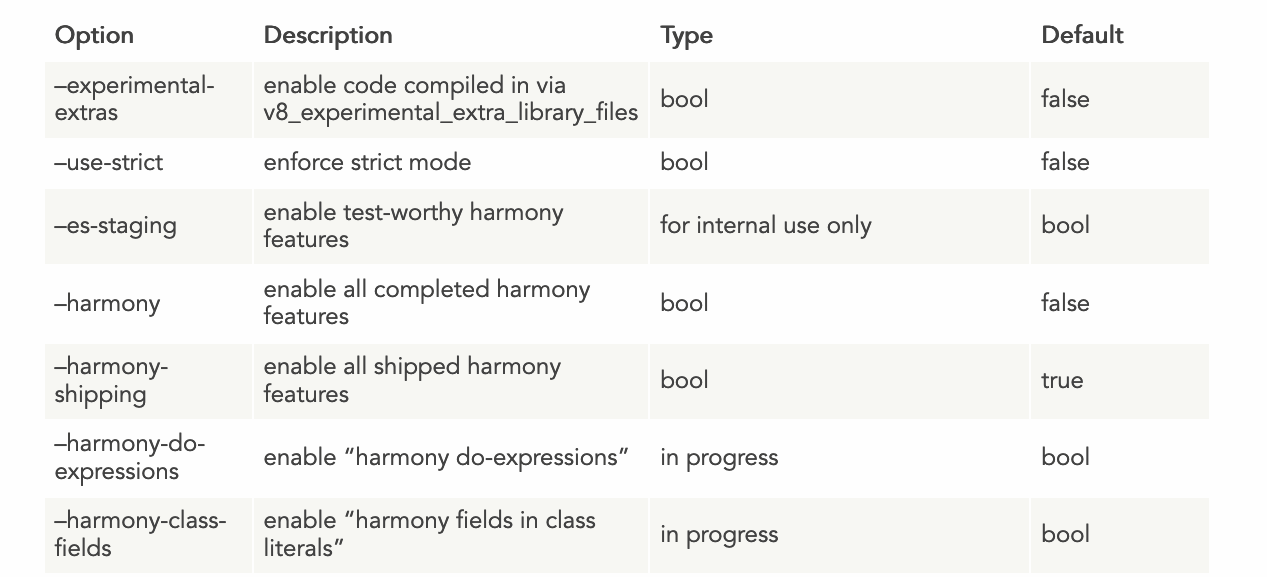
This is the table that gave me the problem:
On mobile, it rendered pretty poorly:
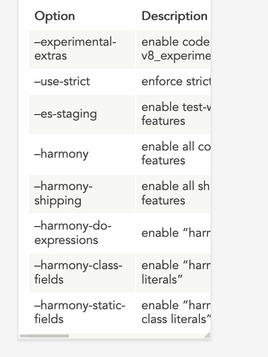
Not a nice user experience, and an error in the Google Search Console. If there’s something I don’t want is an error/warning in that place. Not when it’s something I can fix.
Hugo, the static site generator I use, lets me inject CSS specific to a single page, simply by adding a <style> tag into the markdown file. Handy.
So I started searching for a good way to make my table responsive. I came across this very nice article on CSS Tricks: Responsive Data Tables. It’s from 2011, and still works fine!
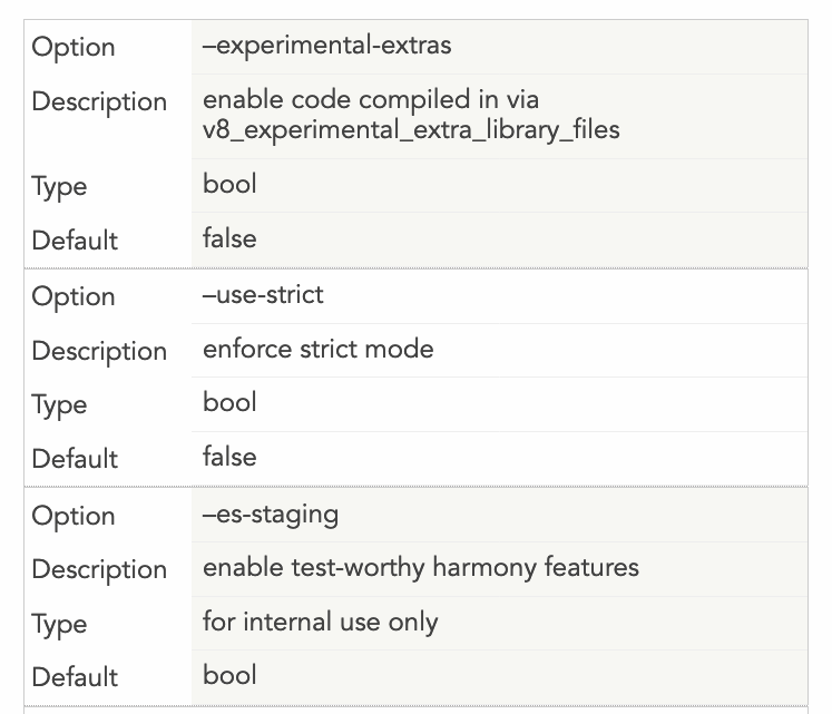
The trick is this: we want to make the table display as a block element rather than as a table in the traditional CSS sense. We hide all the table headings by moving them out of the view, and we insert a new block in the table, and each row will have its own set of headings, like this:
Here is the code that achieves the above design:
@media
only screen and (max-width: 1500px) {
  table, thead, tbody, th, td, tr {
    display: block;
  }
  thead tr {
    position: absolute;
    top: -9999px;
    left: -9999px;
  }
  tr { border: 1px solid #ccc; }
  td {
    border: none;
    border-bottom: 1px solid #eee;
    position: relative;
    padding-left: 200px;
    margin-left: 150px;
  }
  td:before {
    position: absolute;
    top: 12px;
    left: 6px;
    width: 200px;
    padding-right: 40px;
    white-space: nowrap;
    margin-left: -150px;
  }
  td:nth-of-type(1):before { content: "Option"; }
  td:nth-of-type(2):before { content: "Description"; }
  td:nth-of-type(3):before { content: "Type"; }
  td:nth-of-type(4):before { content: "Default";}
}
The important things you’ll want to customize to make your own table responsive are the last 4 lines - you need to enter the title of each “column”, and you need to add more if you have more columns. Or remove them if you have less.
The other thing is the space that the new “headings” will take for each row. I added a 150px margin, and you need to reference it 2 times: one as a margin-left: 150px in the td, and as a margin-left: -150px in the td: before.
Finally, you need to decide when this new layout kicks in. I made it active when the page is less than 1500px, because that table is huge. I could as well make this the default behavior rather than displaying the normal table on huge screens, but so far I think the problem is solved.
I hope this helps.
download all my books for free
- javascript handbook
- typescript handbook
- css handbook
- node.js handbook
- astro handbook
- html handbook
- next.js pages router handbook
- alpine.js handbook
- htmx handbook
- react handbook
- sql handbook
- git cheat sheet
- laravel handbook
- express handbook
- swift handbook
- go handbook
- php handbook
- python handbook
- cli handbook
- c handbook
subscribe to my newsletter to get them
Terms: by subscribing to the newsletter you agree the following terms and conditions and privacy policy. The aim of the newsletter is to keep you up to date about new tutorials, new book releases or courses organized by Flavio. If you wish to unsubscribe from the newsletter, you can click the unsubscribe link that's present at the bottom of each email, anytime. I will not communicate/spread/publish or otherwise give away your address. Your email address is the only personal information collected, and it's only collected for the primary purpose of keeping you informed through the newsletter. It's stored in a secure server based in the EU. You can contact Flavio by emailing [email protected]. These terms and conditions are governed by the laws in force in Italy and you unconditionally submit to the jurisdiction of the courts of Italy.