Stick an element to the bottom of the page with Flexbox
By Flavio Copes
Learn how to stick a footer to the bottom of the page with Flexbox: a column flex container, min height of the screen, and flex-grow on the element above it.
To stick an element to the bottom of the page with Flexbox, make the page a column flex container with a minimum height of the viewport, then let the content above the footer grow to fill the free space.
I’ve had the problem to stick an element to the bottom of a page in case the window was too big (in height). But still be part of the flow of the page if there was not enough screen size.
That last part is the key difference from position: fixed. A fixed footer floats over the content and follows you as you scroll. This footer sits at the bottom of the viewport on short pages, and behaves like a normal element on long pages.
Here is a very minimal example I made using Tailwind CSS:
<html>
<body class="text-center">
<p>test</p>
<p>© 2022</p>
</body>
</html>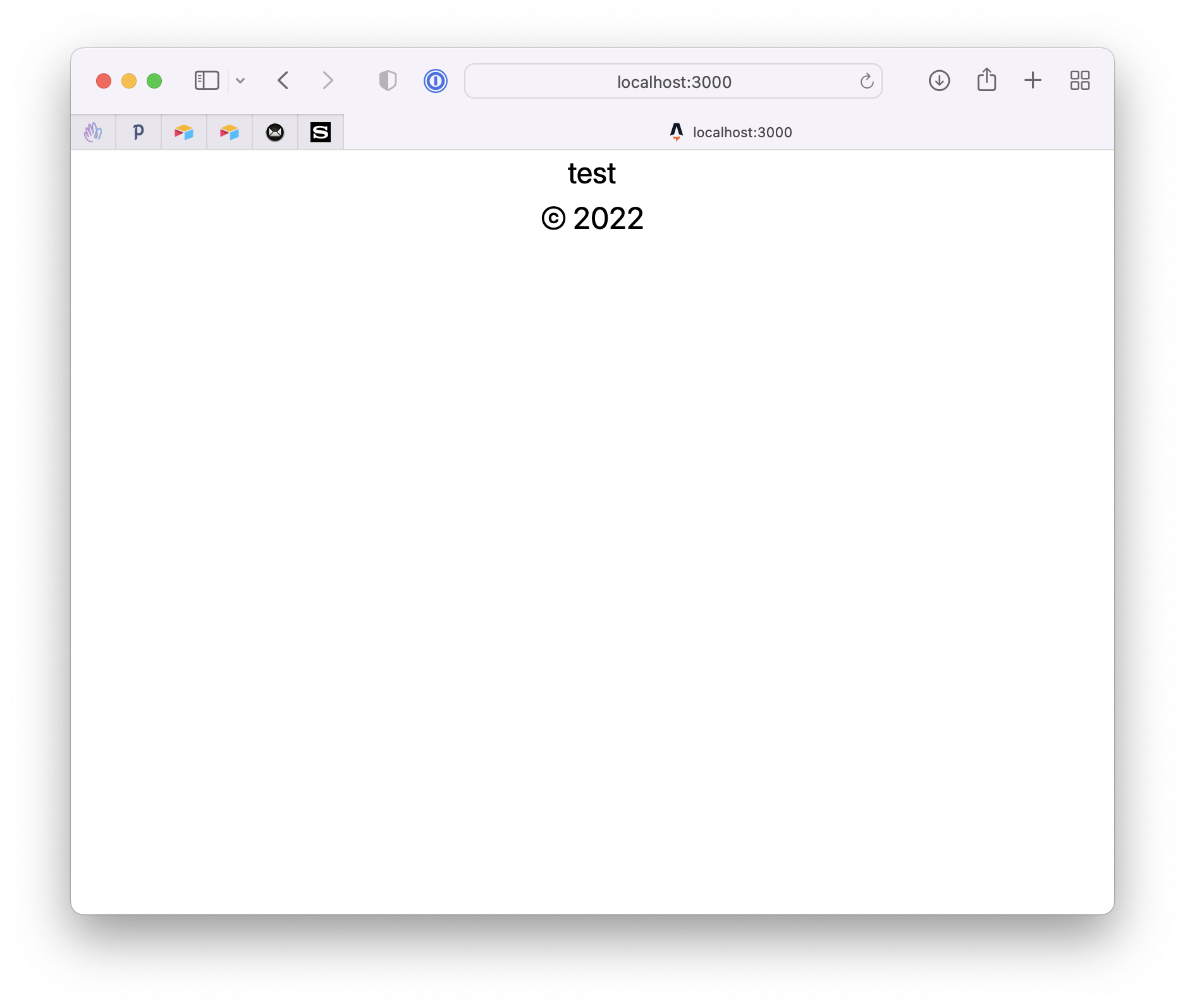
We want the “footer” HTML element to stick to the bottom using Flexbox.
So we first use Flexbox (flex flex-col), we set the minimum height to the screen (min-h-screen).
Tailwind’s min-h-screen maps to min-height: 100vh. On mobile the URL bar shows and hides, and 100vh often does not match the visible viewport. Tailwind also has min-h-dvh, which maps to min-height: 100dvh and tracks it.
Then we add flex-grow to grow the preceding element of the footer:
<html>
<body class="text-center min-h-screen flex flex-col">
<p class="flex-grow">test</p>
<p>© 2022</p>
</body>
</html>This code generates this result:
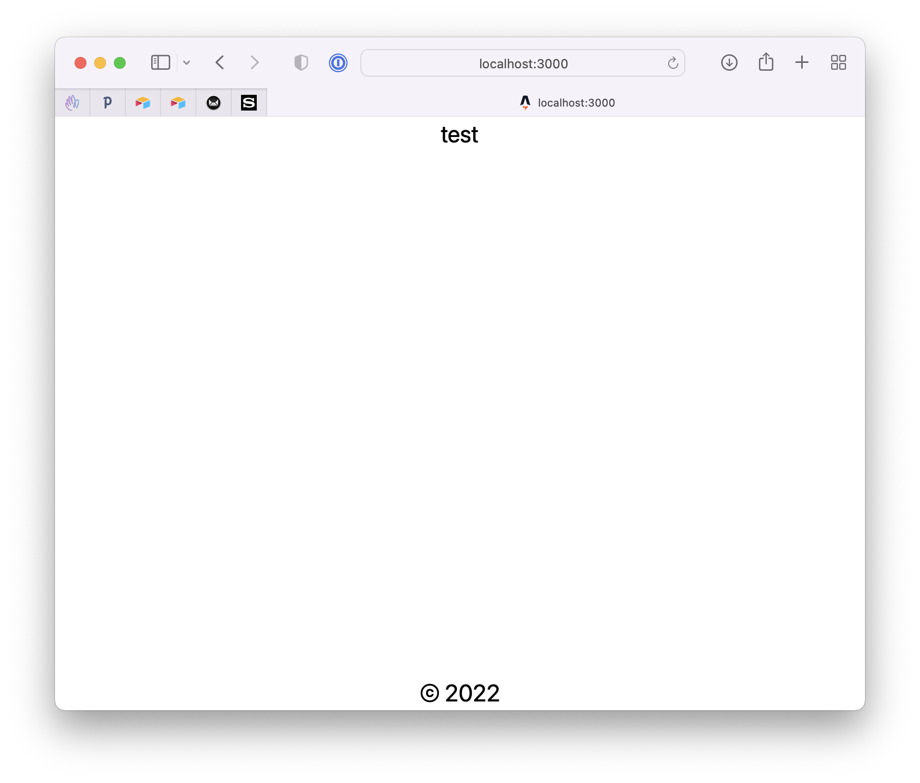
How does it work?
If you’re not using Tailwind, those utility classes translate to this plain CSS:
body {
  display: flex;
  flex-direction: column;
  min-height: 100vh; /* legacy */
  min-height: 100dvh; /* preferred: tracks mobile browser chrome */
}

.content {
  flex-grow: 1;
}
The body becomes a flex container stacking its children vertically. min-height: 100dvh makes it at least as tall as the visible viewport, even when there’s little content. Keep 100vh above it if you want a fallback for very old browsers.
flex-grow: 1 tells the content element to absorb all the leftover vertical space. The footer gets pushed down to the bottom edge.
An alternative is to skip flex-grow and put mt-auto (margin-top: auto) on the footer instead. In a flex container, an auto margin eats the free space, and the effect is the same.
Be careful with min-height vs height
A common mistake is using h-screen (height: 100vh) instead of min-h-screen.
It looks identical on a short page. But when the content grows taller than the viewport, the container stays locked at viewport height, the content overflows it, and the footer ends up floating in the middle of your text.
min-height sets a floor, not a ceiling. The page can still grow, and the footer moves down with it.
To see how flex-grow and the other flex properties interact, try my free flexbox playground.
Want me to talk about your product? You can sponsor this site.
Related posts about node: