SwiftUI forms: DatePicker
By Flavio Copes
Learn how to use the DatePicker control in SwiftUI to let users pick a date and time, and how displayedComponents limits it to just the date or time.
The DatePicker form control in SwiftUI lets us create a date picker.
How does it work?
First we create a property of type Date:
@State private var dateChosen = Date()We use @State so that we can modify this value from our
DatePickerview
Then we link that property to the DatePicker view:
DatePicker(selection: $dateChosen, in: ...Date()) {
    Text("Pick a date and time")
}
in: ...Date() limits the choice to dates up to now. Leave it out if any date is fine.
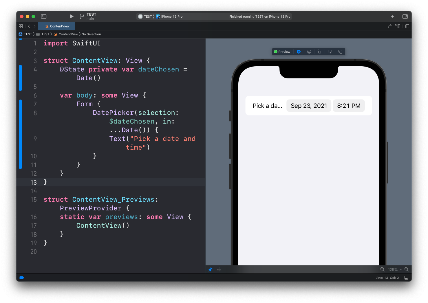
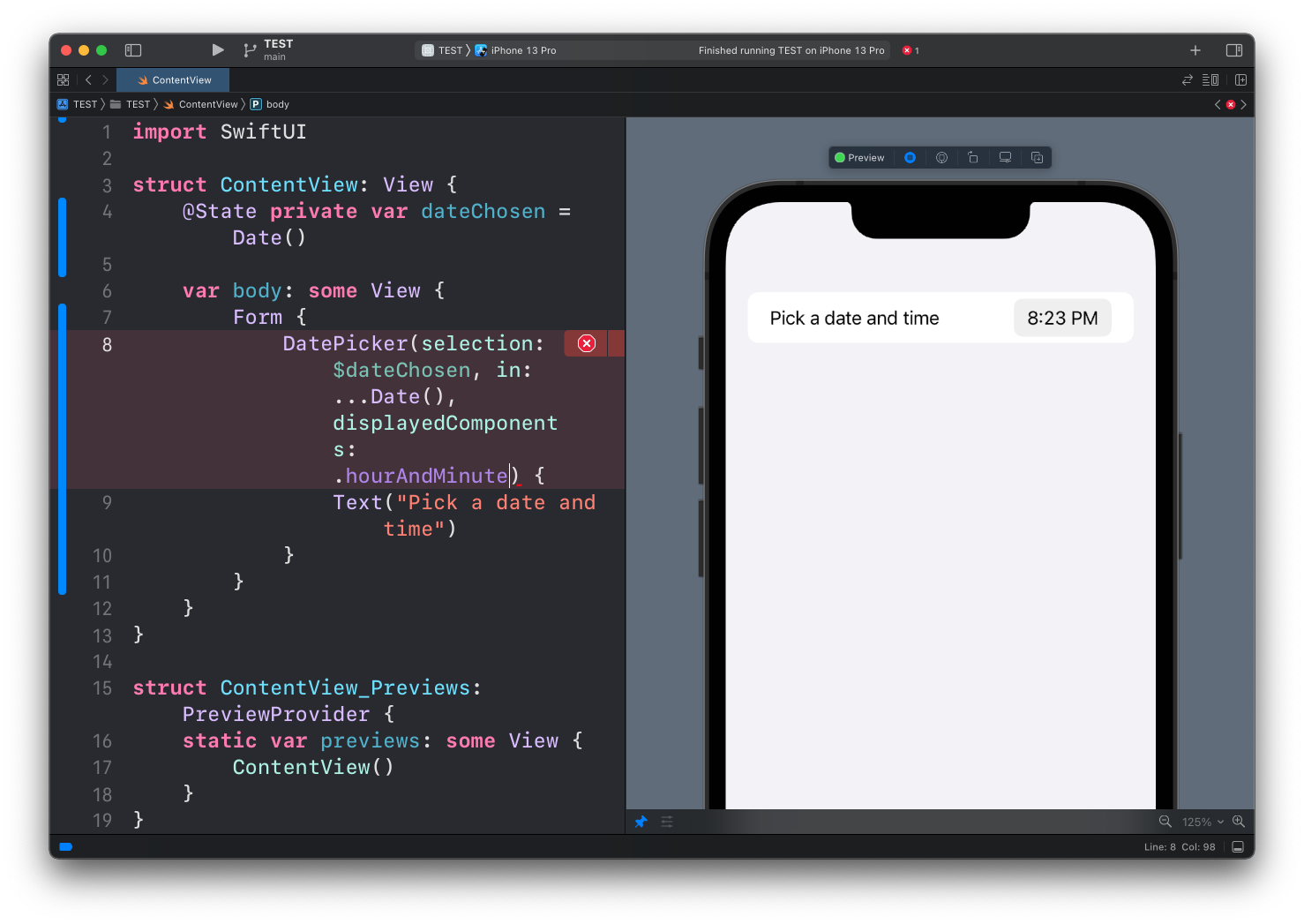
Inside a Form the picker uses the compact style by default, a single row with the label and the current value. Here’s how it looks:
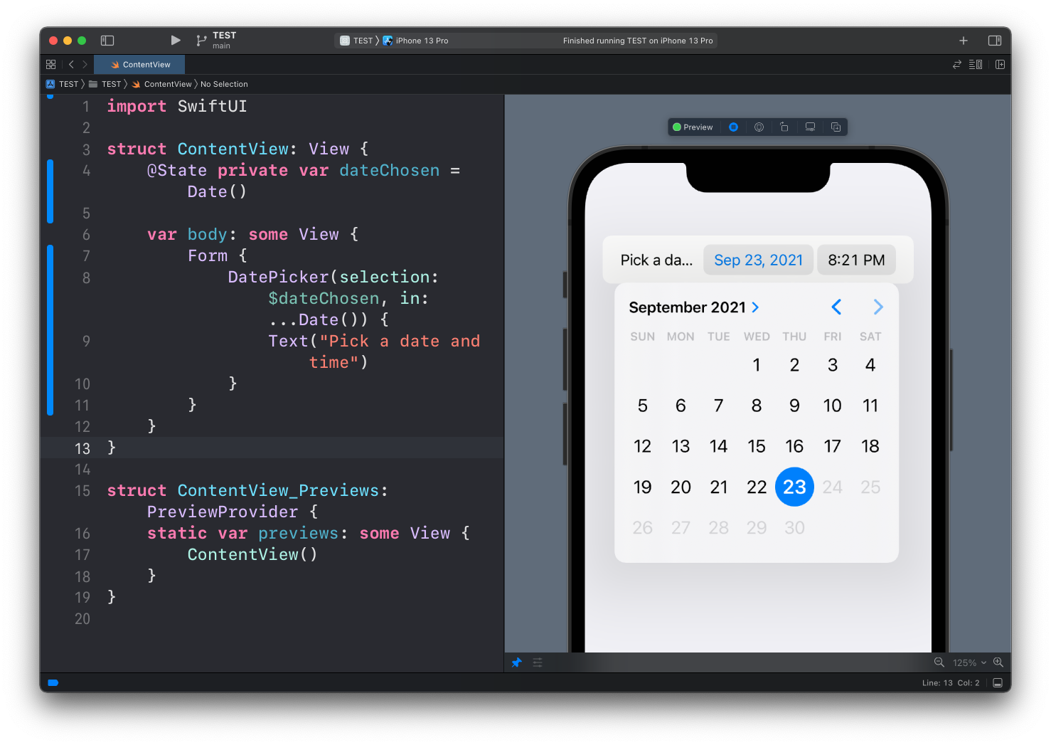
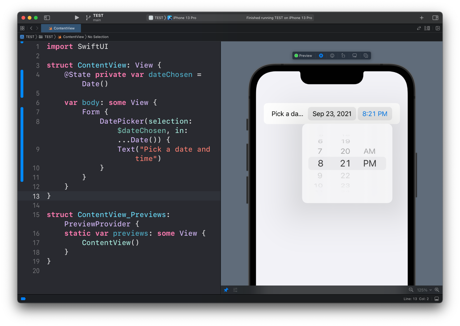
Tapping on each different part (date or time) will show a dedicate picker UI element:
Here’s the full code of this example:
struct ContentView: View {
    @State private var dateChosen = Date()

    var body: some View {
        Form {
            DatePicker(selection: $dateChosen, in: ...Date()) {
                Text("Pick a date and time")
            }
        }
    }
}
The label as a string
When the label is plain text, you can pass it as the first argument instead of a closure, the same way you do with a TextField:
DatePicker("Pick a date and time", selection: $dateChosen, in: ...Date())Both forms do the same thing. Keep the closure when the label needs its own views, like an icon next to the text.
Styles
You can change how the picker looks with .datePickerStyle():
DatePicker(
    "Birthday",
    selection: $dateChosen,
    displayedComponents: .date
)
.datePickerStyle(.graphical)

DatePicker(
    "Reminder",
    selection: $dateChosen,
    displayedComponents: [.date, .hourAndMinute]
)
.datePickerStyle(.compact)

DatePicker(
    "Alarm",
    selection: $dateChosen,
    displayedComponents: .hourAndMinute
)
.datePickerStyle(.wheel)
.compact is what you get in a Form by default. .graphical shows the calendar inline, always open, no tap needed. .wheel is the old scrolling columns, and it still makes sense when you want the wheels visible all the time, for example in an alarm screen.
Date only, or time only
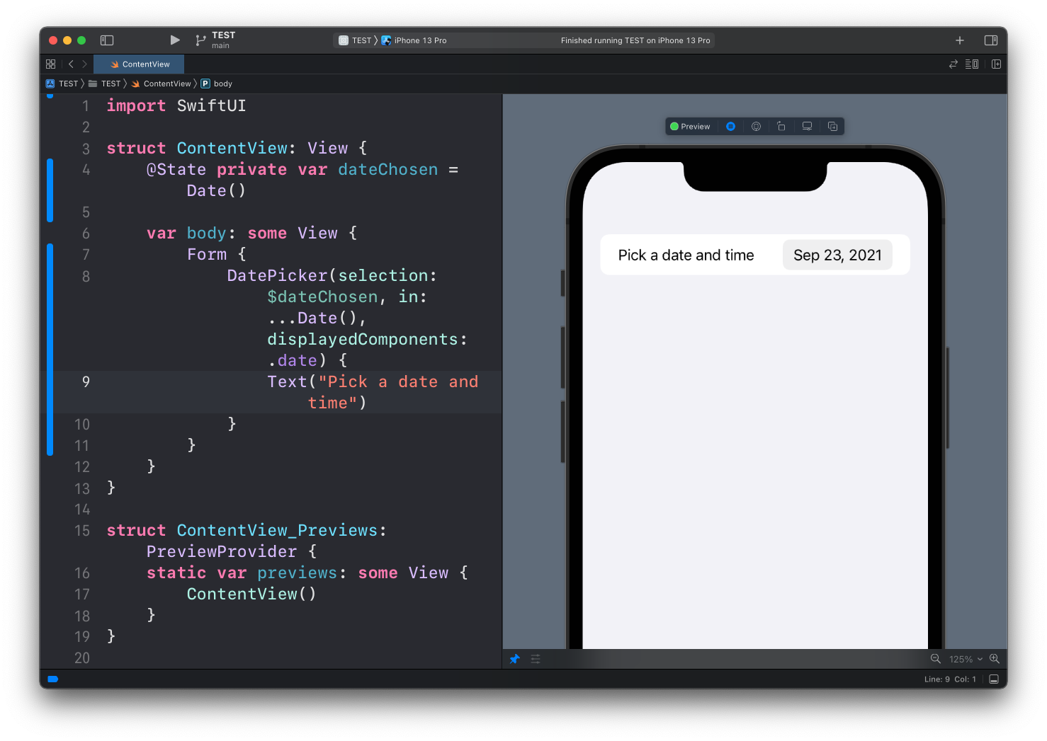
You can choose to only show one particular element of the date with the displayedComponents property, like just the date:
DatePicker(selection: $dateChosen, in: ...Date(), displayedComponents: .date) {
    Text("Pick a date and time")
}
or just the time:
DatePicker(selection: $dateChosen, in: ...Date(), displayedComponents: .hourAndMinute) {
    Text("Pick a date and time")
}
When you leave displayedComponents out, you get both, which is what the first example did.
Want me to talk about your product? You can sponsor this site.
Related posts about swift: